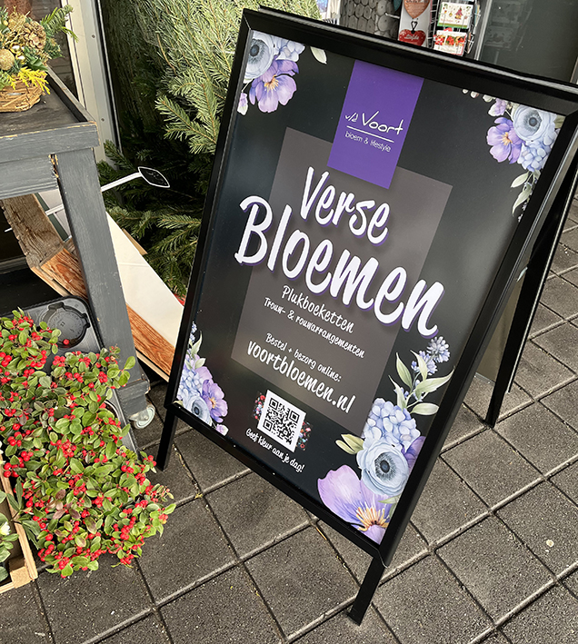
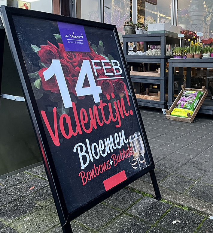
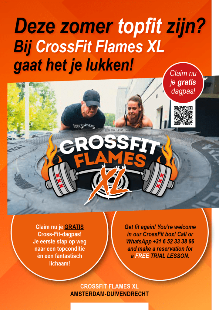
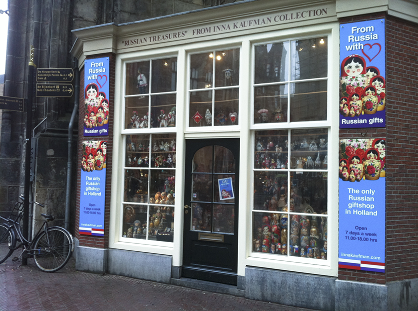
Creatief bureau Roverstudio produceert in opdracht voor stichtingen, verenigingen, het MKB tot multinationals: huisstijl, logo, GoogleAds, (promo)video-presentaties, magazines, actie-flyers, interactieve PDF’s en… natuurlijk prachtige advertenties. Meedenken en uitvoeren is ons vak. Om het verhaal van uw organisatie zo expressief en helder te vertalen….(en dat alles tegen een aantrekkelijke prijs…).
Examples (lookbook)
Onderstaand:
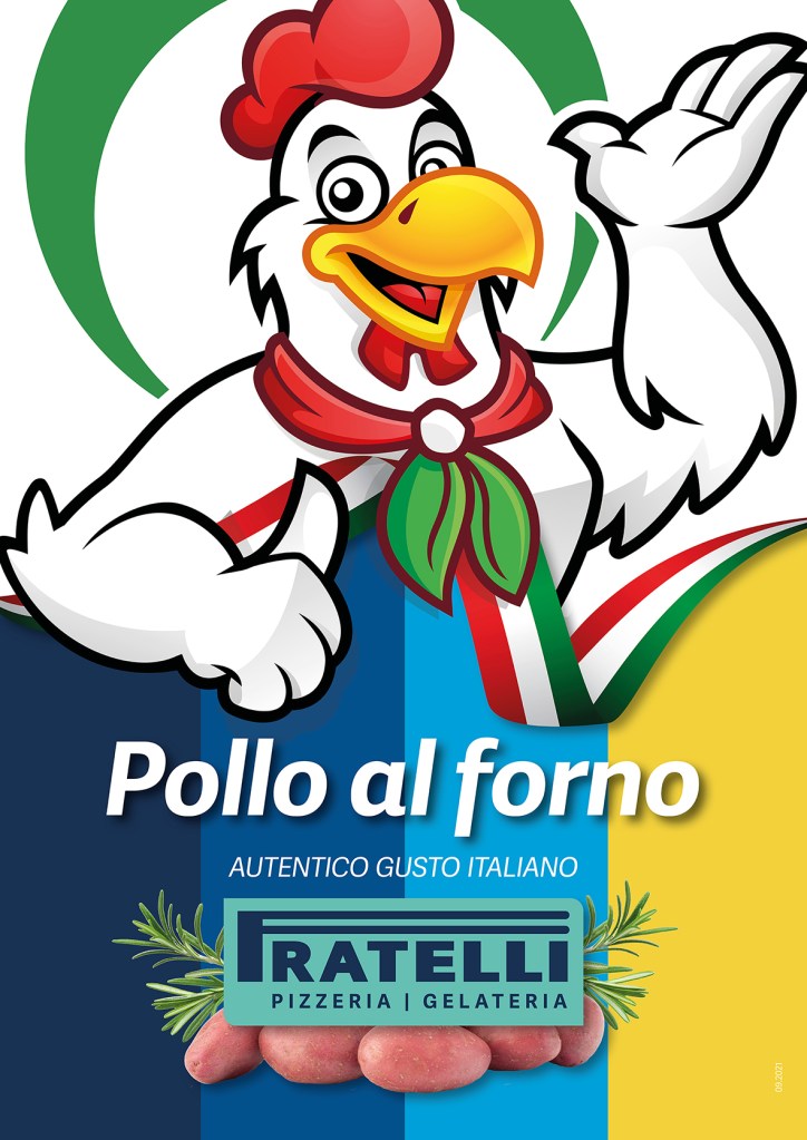
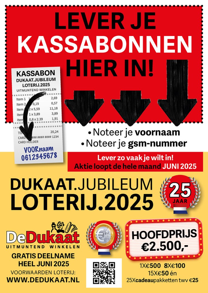
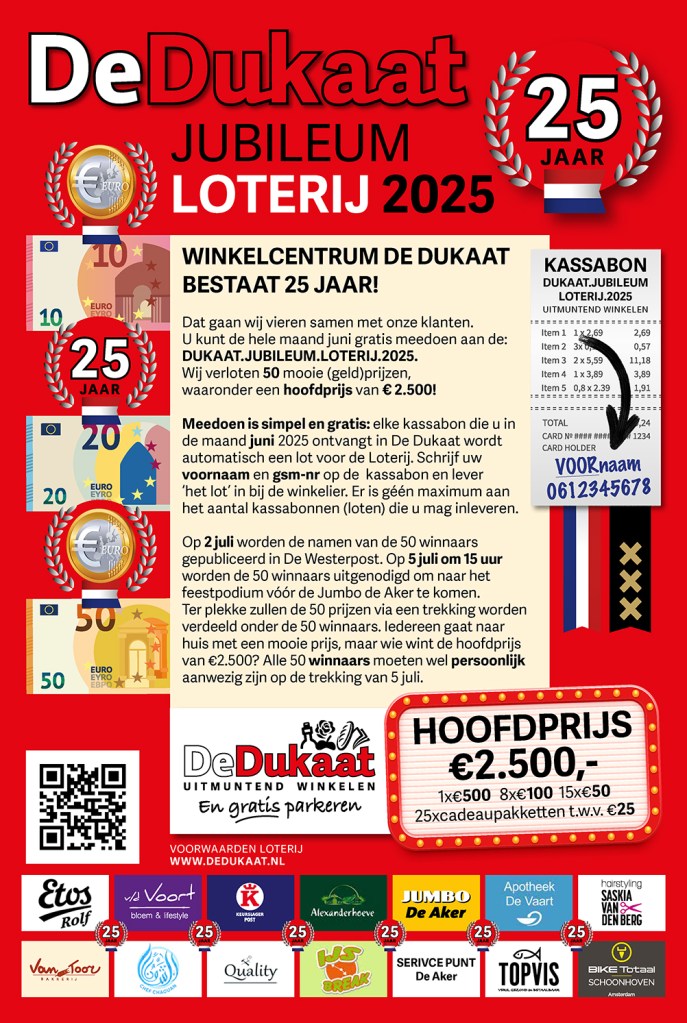
Voorbeelden van enkele opdrachtgevers uit het MKB zijn er ook te vinden bij Roverstudio. Have a look in this lookbook:


Summer 2025 – It took years to create (and to keep this brochure up-to-date). Proud to participate for one of worlds’ most prestigious brand of handpainted fountain pens. It truly is a created world of dreams and wonders for worldwide collectors for these rare objects. http://www.phoenixlacquerart.com is an Amsterdam based producer of fountain pens. Check out the models we presented for them:
https://indd.adobe.com/view/8a910bdb-a56d-4302-80ba-4f0cb603a0af
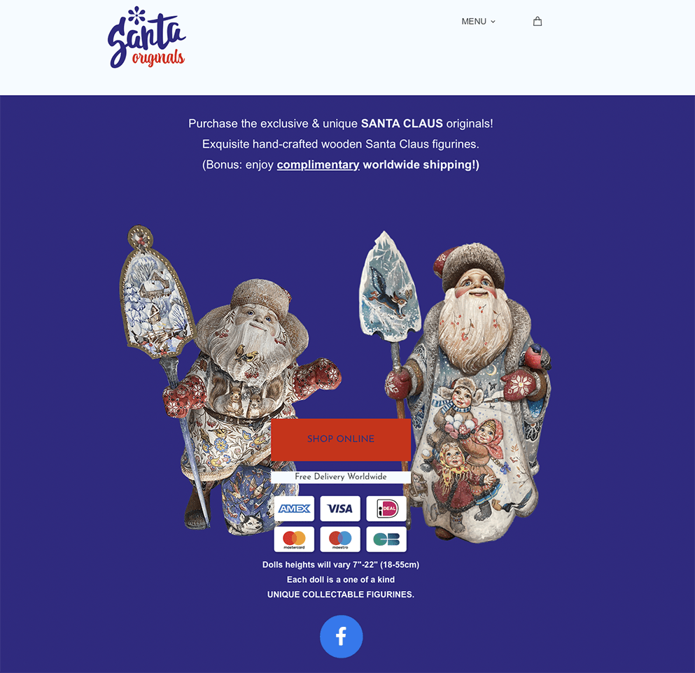
January 2025 – to clearify the address change of the actual shop shifted from Damsquare Amsterdam to Singel (also in Amsterdam, the Netherlands): we’ve created this small video to promote this (address change) on Facebook and the website of the company: http://www.santaoriginals.com.
Summer 2023 – Created in just over 2 months; concept and photography a website (more a webshop) to promote and sell unique handcrafted and handpainted – in an artisan way – all over the world: Santa’s! For years there are collectors who are pursuing these wonderful objects d’art. Check out this project: santaoriginals.com.
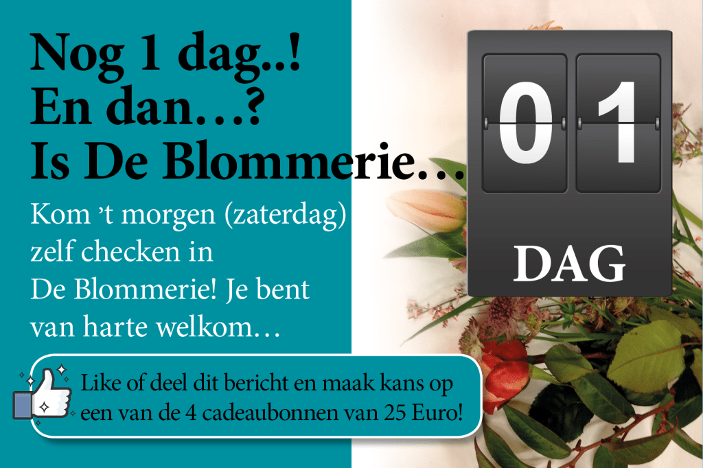
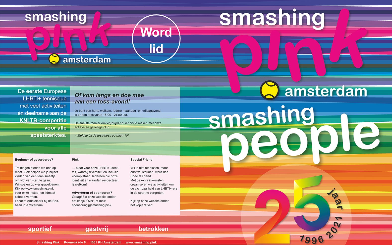
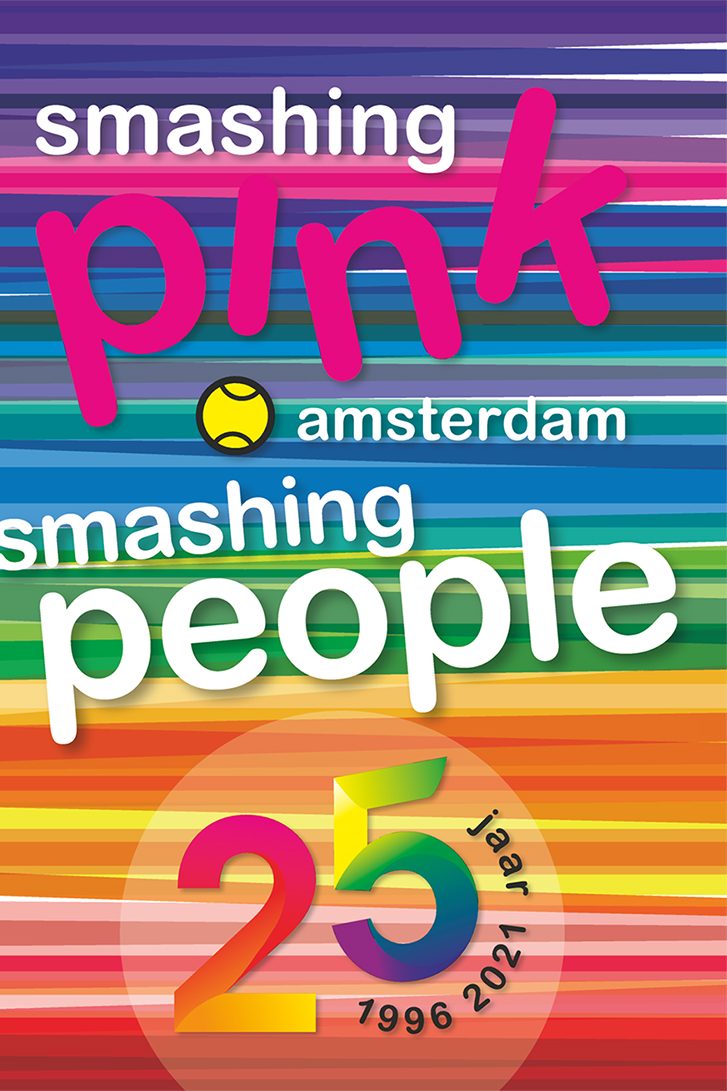
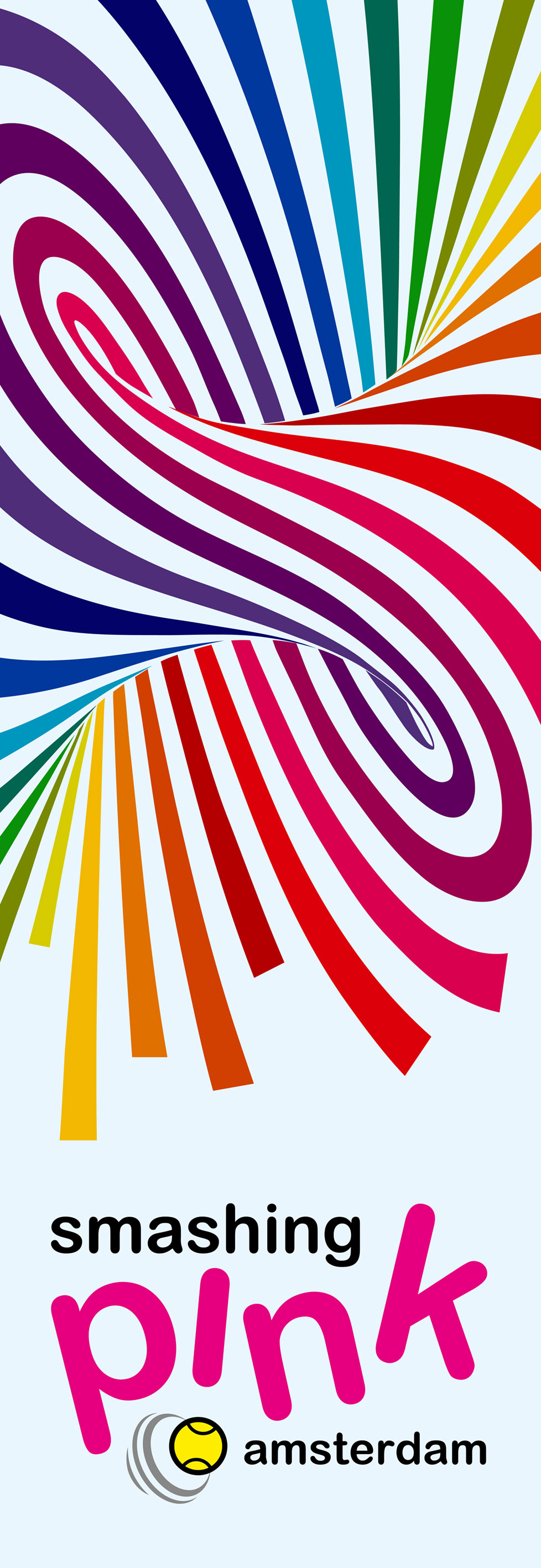
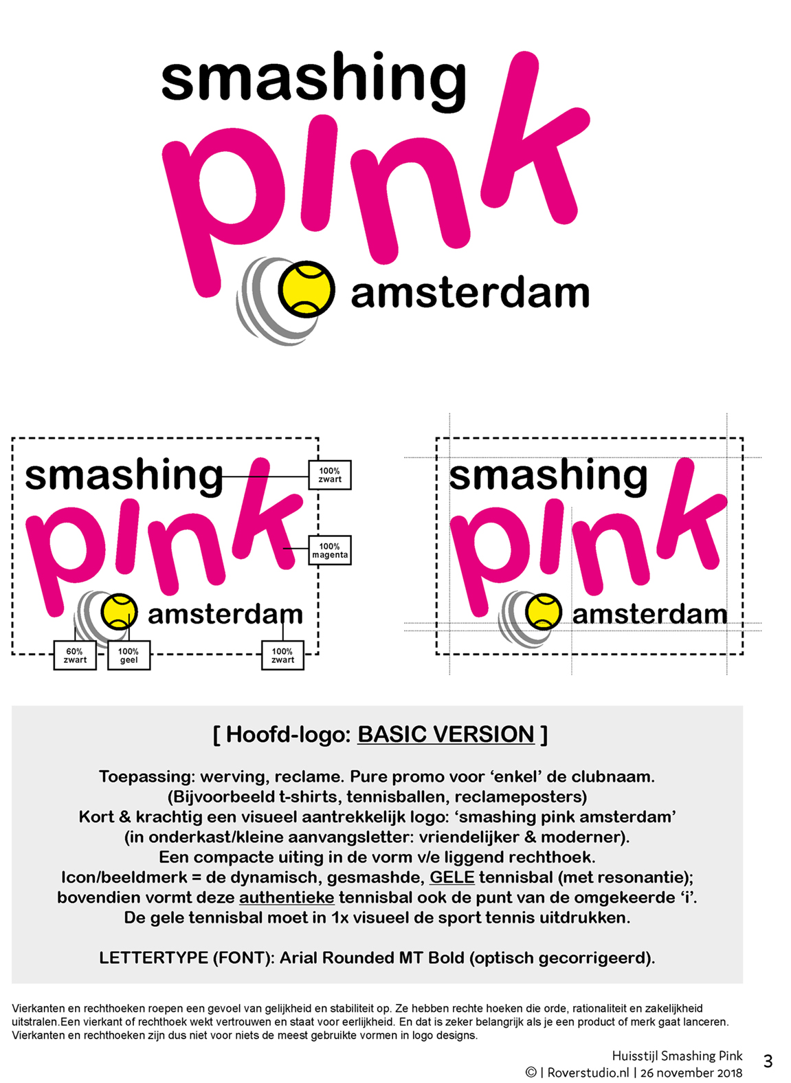
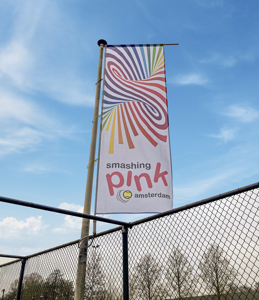
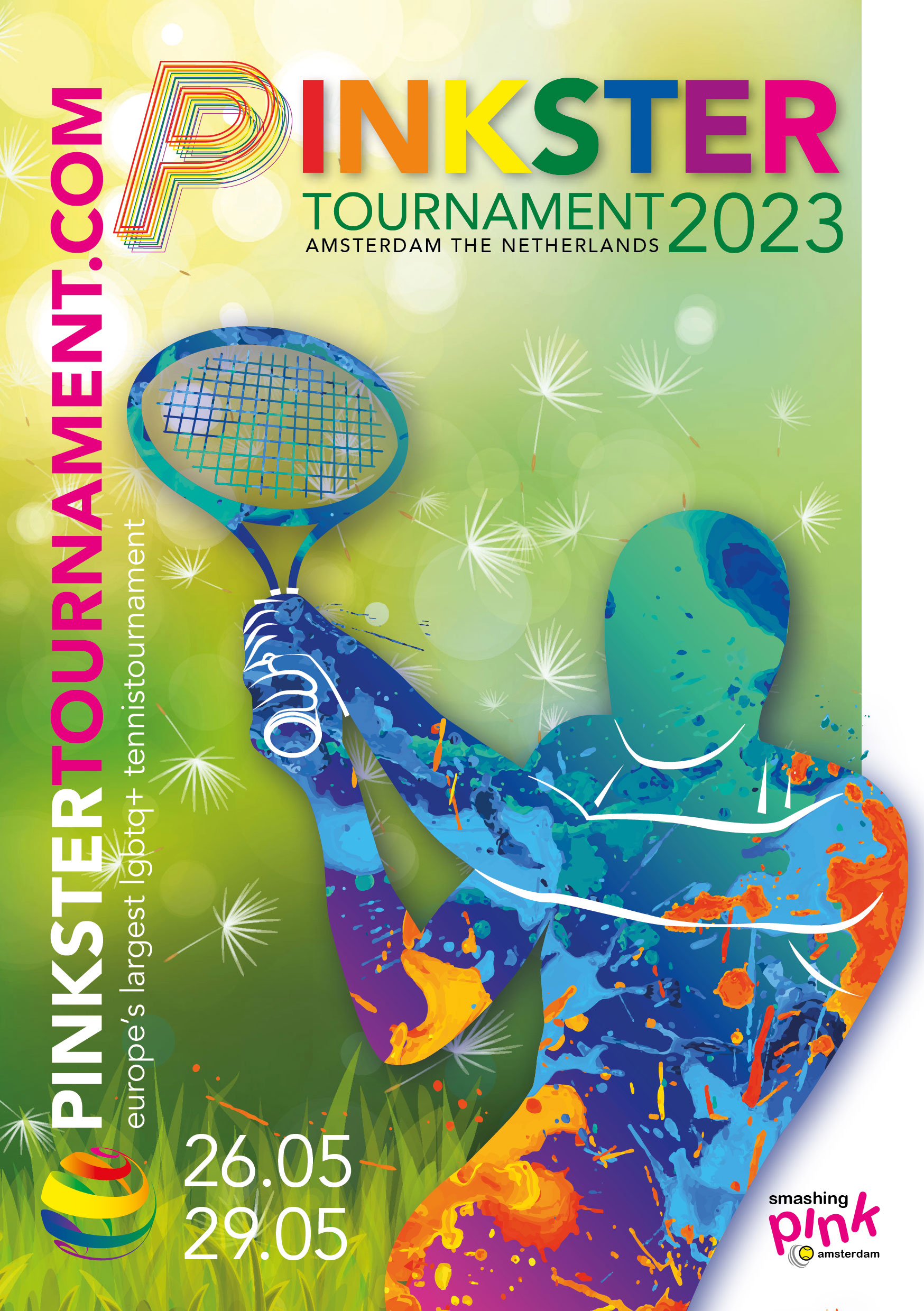
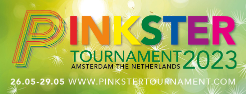
De afgelopen jaren verzorgt Roverstudio diverse uitingen voor tennisclub Smashing Pink in Amsterdam. Zowel in 2018 de update (opfrissen) van de huisstijl; als vanaf dat jaar ook de jaarlijkse promotionele uitingen voor het grootste toernooi van Smashing Pink: het jaarlijkse Pinkstertournament.
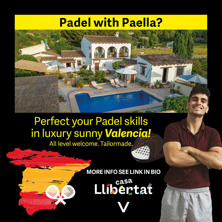
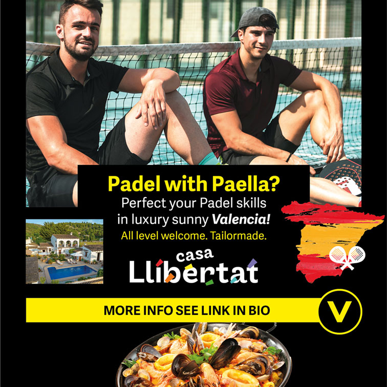
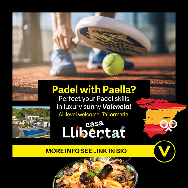
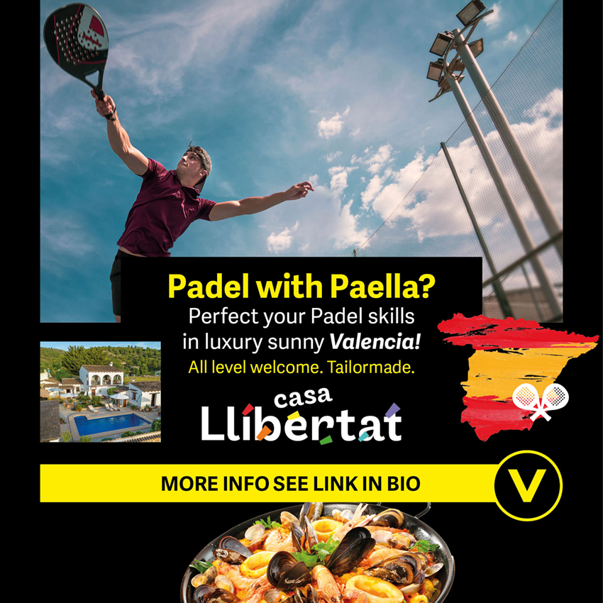
2023: Combineer wellness en sportieve outdoor-activiteiten in een locatie als de Costa Blanca Spanje? Wij hebben destijds een aantal suggesties voor promotie (Facebook) gedaan: https://casallibertat.com. Met slogans als ‘Padel with Paella?’ om de spijker op zijn kop te slaan…
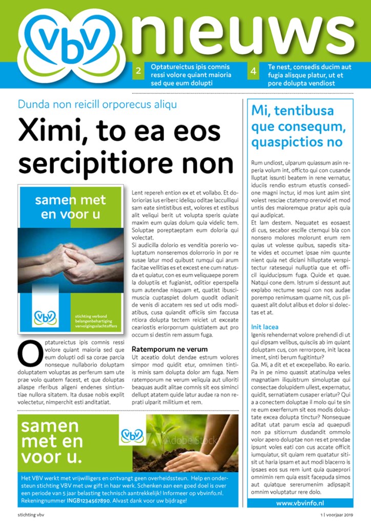
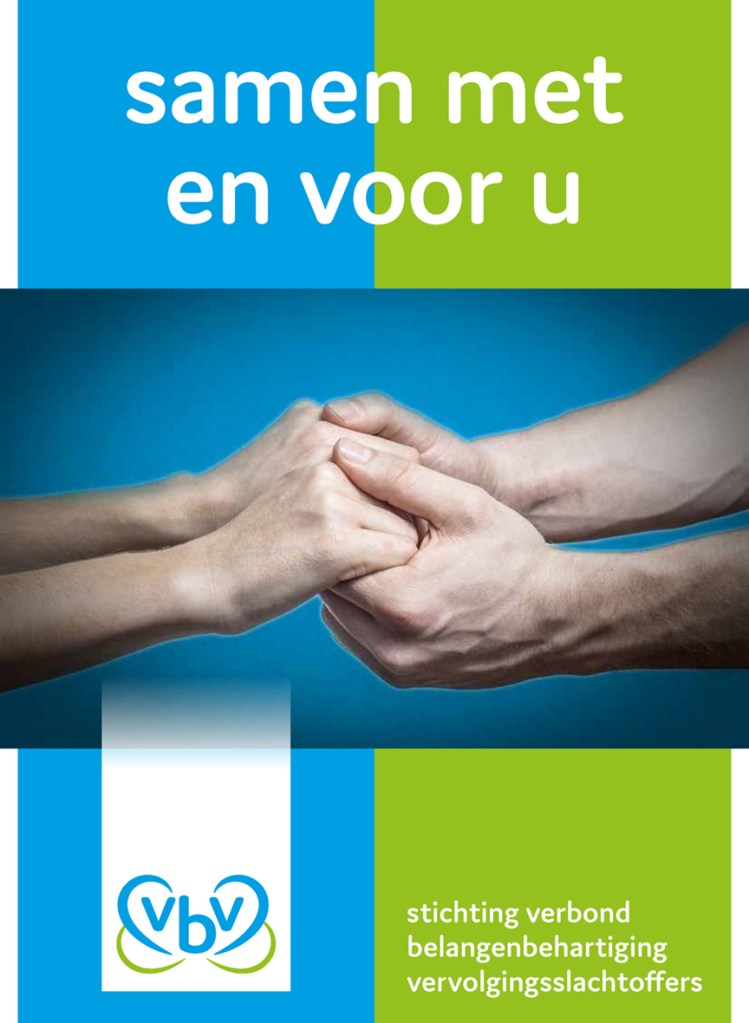
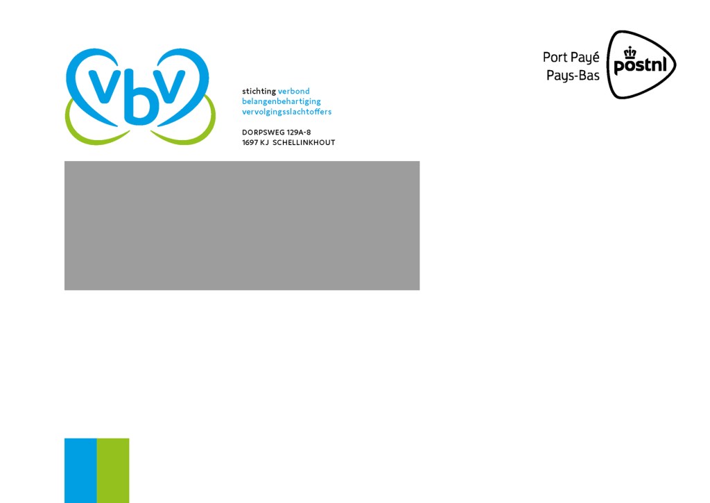
[dutch] Opdrachtgever: stichting VBV..
Roverstudio verzorgt (sinds 1998) met name de productie/ontwerp voor het magazine ten behoeve van haar leden. In 2019 werd besloten de huisstijl helemaal op te frissen aangezien de organisatie koos voor een andere rechtspersoonlijkheid; VBV werd een stichting met ANBI-keurmerk. Het lettertype dat gebruikt is voor de letters v-b-v: DOMUS. Waarom dit lettertype? Domus heeft zachte curves.De letters v-b-v zijn in onderkast (oogt ‘laagdrempeliger’). In het logo worden de letters v-b-v aan beide zijden geflankeerd door stroken die tezamen een hart vormen. 2x een hart: 1x in blauw en 1x in groen. 1x voor vertrouwen en 1x voor een actief innerlijk gevoelsleven. Vraag: waarom 2x een hart? Antwoord: stichting VBV gaat de dialoog aan. Het hart staat bij het VBV symbool voor een zinvol en waardevol Deze elementen zijn van belang voor de uitstraling van het VBV. Hier enkele voorbeelden voor de gekozen uitstraling:
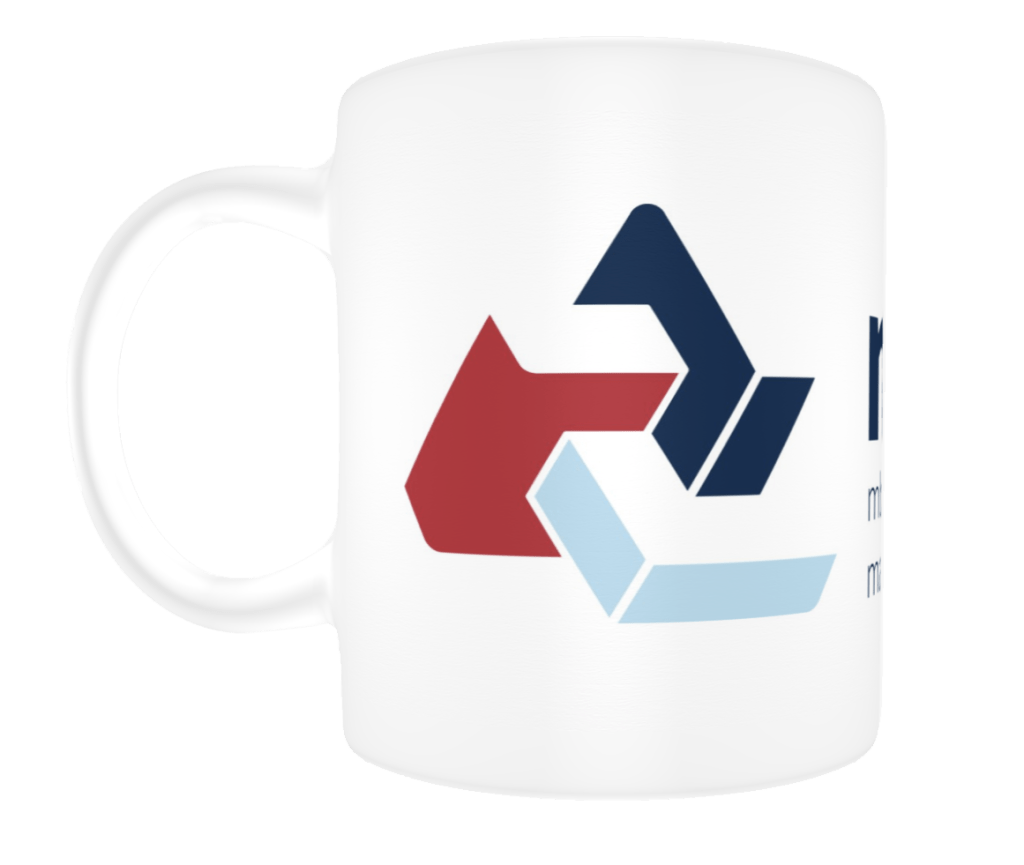
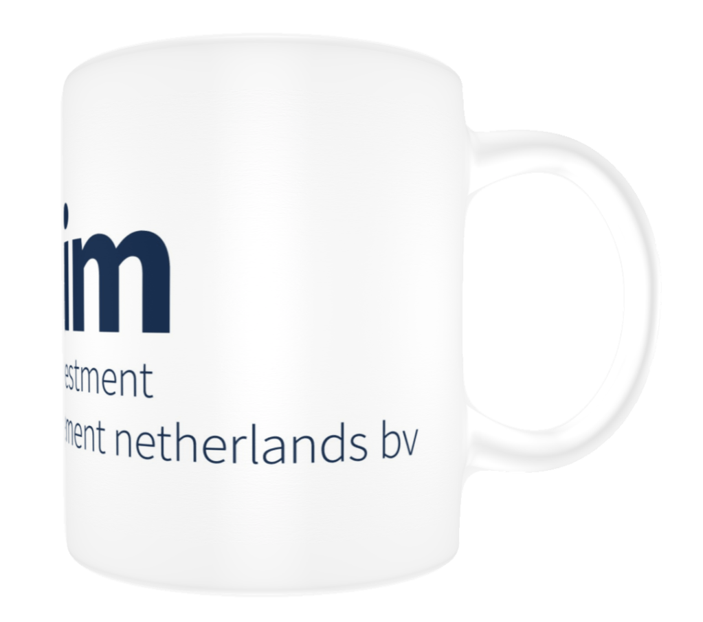
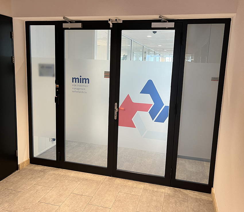
[eng] Since 2021 we have been creating a corporate identity for our international account which is active in the world of accountancy. Roverstudio makes sure for each of our accounts that the created content is best considered for impact, radiance and story-telling. From the icon-base we expand the company-expressions out to all kinds of communication-levels: